My design harness: one brief, ten aesthetics
How my design harness works: references, judgment and generation wired into one flow that turns a single brief into any aesthetic. With a real example.

Most “AI designs your UI” demos end the same way. The output is smooth, competent and completely faceless: the same beige background, the same violet-blue gradient, the same rounded cards. You can tell a model made it from the first screen.
I went a different route. Instead of “one prompt, one image” I built what I call a design harness: reference sources, a layer of judgment and a set of generators, wired into a single flow. One brief goes in. A finished artifact comes out, in whatever aesthetic the moment needs. Want cosmos, you get cosmos. Want a terminal, a riso zine or a Swiss grid, you get that too, from the same brief.
First what it produces, then how it is built.
What it produces
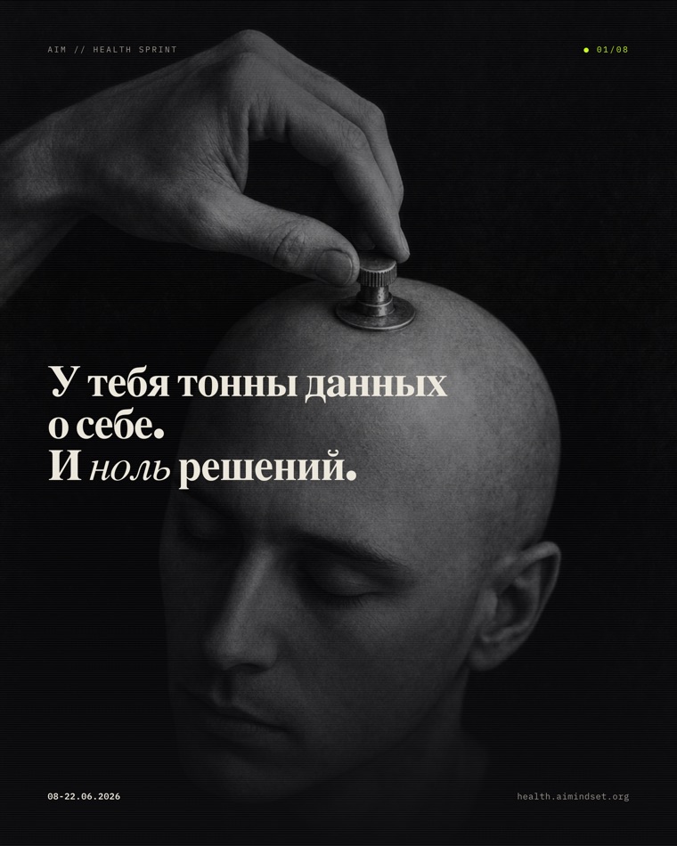
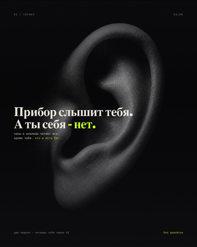
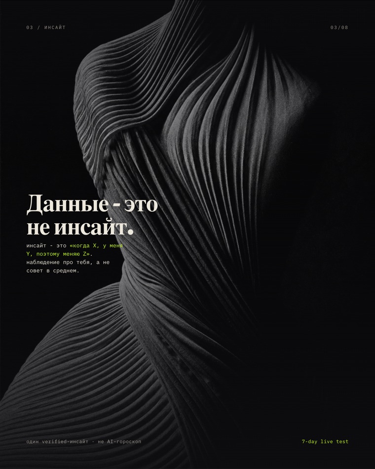
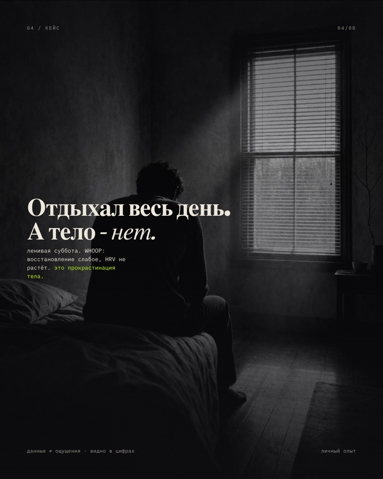
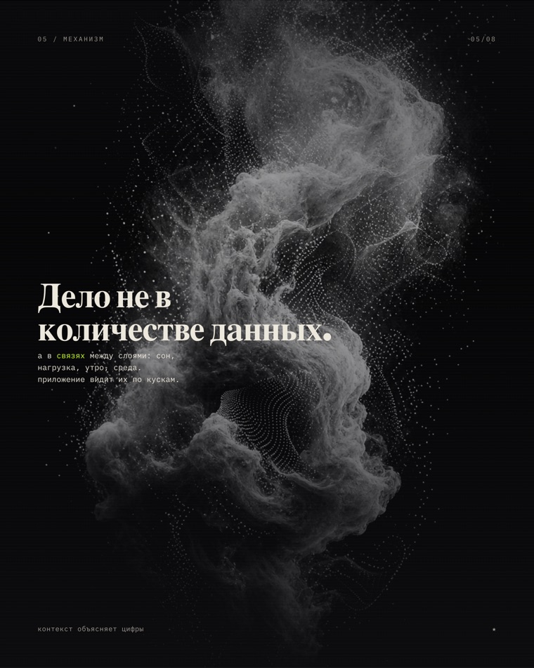
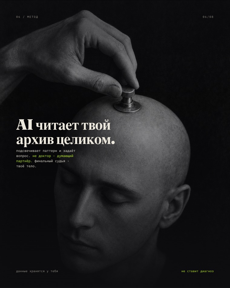
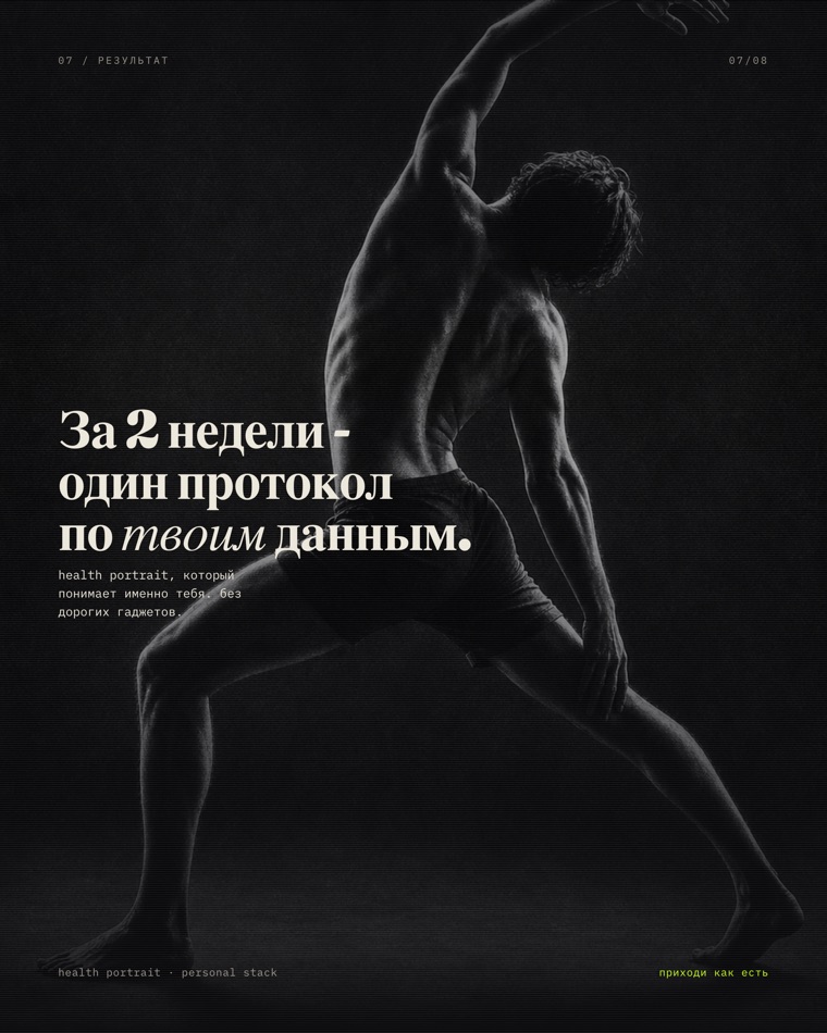
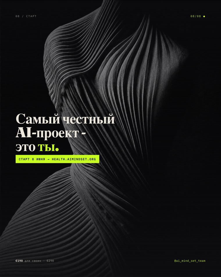
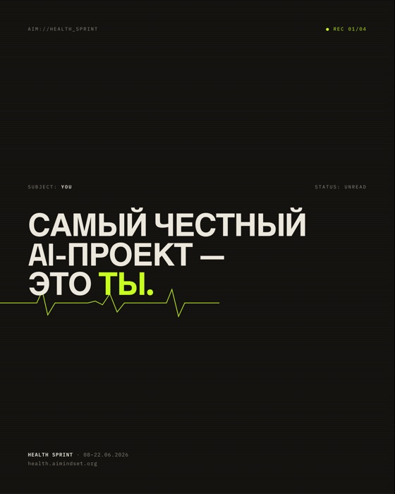
The most honest example is a carousel we built for a two-week health sprint (an intensive about health through your own data). One brief: “the most honest AI project is you; you have tons of data about yourself and zero decisions.” The harness dressed that brief in a cosmos theme: monochrome photography, a charcoal background, a large serif headline in Cyrillic, a single acid-green accent.
One brief · eight slides · cosmos theme
← swipe →
These eight slides are not stock and not someone else’s art. The images were generated for the brief (which is why they are safe to publish), the layout and typography were built in code, and the export targets Instagram’s 1080×1350.
Here is the same brief run through other engines in the harness:
Same line · different engines
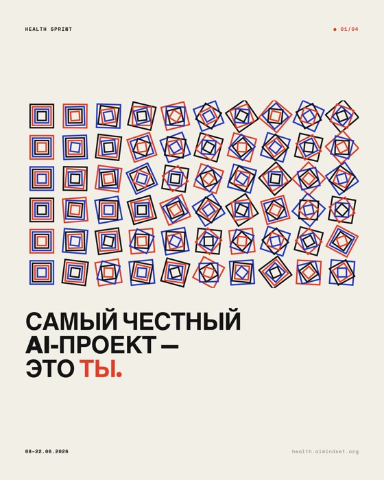
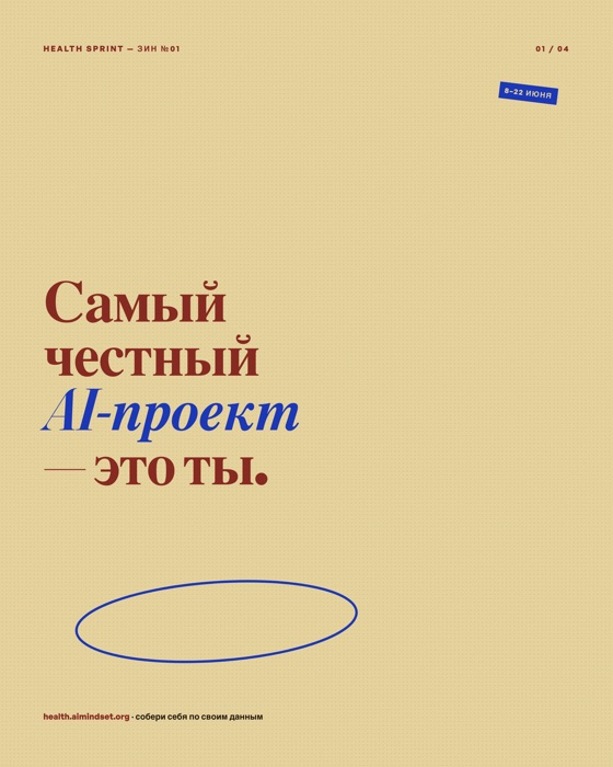

One line, five characters. That is the point: the value is not one pretty picture, it is that the aesthetic is a preset you can swap without losing the message or sliding into slop.
What it is made of
The harness rests on three layers. Order matters: grounding first, then judgment, then generation.
Layer 1. References (grounding)
Before opening the editor, the harness assembles a short reference brief. This is a rule, not a nice-to-have: no brief, no next step.
- Mobbin - a library of actually shipped interfaces (hundreds of thousands of screens). The priority gate for any UI task: to keep from breaking UX, first look at how live products solve it.
- Cosmos - broad lateral inspiration: non-interface references, retro posters, architecture, textures. It keeps the result from being “another dashboard.”
- minimal.gallery - curated full sites, for web-craft tasks.
- A style library - 16 ready directions, from editorial luxe and clinical minimal to acid graphics and neo-brutalist. Each style is one sheet: palette, fonts, motion philosophy and ready search queries.
Layer 2. Judgment (taste)
Between reference and generation sits the layer that decides what to make and what not to let through.
- An orchestrator routes the task (landing page, native screen, carousel or illustration) and pulls in the right skills.
- A catalog of anti-slop fingerprints - the tells that give AI design away: default colors, predictable type, lazy shadows, generic icons. A checklist of what should not be here.
- Pattern-breaking skills: metaphors, creative-break, product thinking. They kick in when the result is “technically fine but boring.”
Layer 3. Generation (production)
Only here is a pixel drawn. There are several generators, because the artifacts differ.
- Google Stitch - streaming UI-screen generation.
- Image models (Codex image_gen as default, Nano Banana as fallback) - heroes, illustrations, textures, transparent assets.
- Code-art - graphics the code draws itself: Molnár-style generative grids, animated SVG. Our own graphics, no one else’s IP.
- DESIGN.md - the design system as code: tokens in YAML plus rationale in Markdown, so the result can be frozen and handed to production.
On top sits a single entry. The /design <task> command launches the whole flow, and the harness is mirrored across Claude Code, Codex and Antigravity (Gemini), so the process is the same whichever one I sit in.
How a carousel comes out of this
A carousel is a good cross-section, because it shows why “change the aesthetic” is cheap. The skeleton is one for all variants: HTML with horizontal scroll-snap, a 4:5 panel, one line per slide, clamp() fonts sized to height. Only the graphics source changes, and there are five of them:
- Hand-coded - layout and type, like terminal / riso / acid above.
- Code-art - JS draws the graphics on the page (generative Swiss).
- AI images - the brief goes to an image model, out comes a PNG as a full-bleed background (the cosmos variant).
- Licensed photo - clean stock under one coherent filter.
- A Cosmos moodboard - internal reference only, never shipped (third-party art).
The finish is the same for all: a headless browser renders each slide at 1080×1350 to PNG. That is “saving the carousel” for posting. The layout check is automated too: zero overflow, no mid-word breaks.
Why this is a harness, not a “prompt”
Anyone can generate an image today. The difference is the wiring:
- references hold the UX and keep it out of generic;
- the judgment layer cuts slop before it reaches the output;
- generators are interchangeable, so the aesthetic is a switch, not a rewrite;
- the final “send” always belongs to a human. The harness prepares, proposes, queues. I publish.
One brief in. Any aesthetic out. On tap, with checks, without slop. That is the whole point.